Wednesday, November 25, 2015

emphasis... EMPHASIS!!!!

Focal Point
Focal Point is basically where your eye is drawn to on any design.


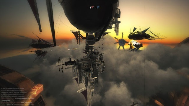
Your eye is drawn to the middle of the sparks just above the barrel of the guns making that the focal point of this piece.

Contrast


In this image, the silhouette of the ship stands out from the sunset and create a focal point. 

Isolation


While small, the explosion is a focal point based on the fact that it is far away from the other ship taking up a larger portion of the image. it's "isolated"

Placement


The placement of the emphasized ship is in the middle and larger than the other two, making you eye look more into the detail of that ship over the others.

Single Element


The single ship surrounded by nothing specific or detailed is the only element in the picture to look at so that all your eye is drawn to.

Whole Over Parts


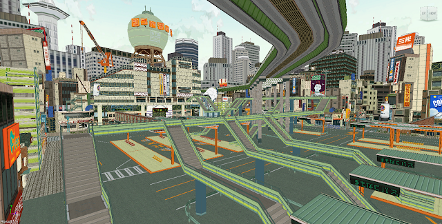
In this image your eye isn't drawn to any one figure because they're all evenly spaced, the same size, and same color so it puts emphasis on the entire image over one or two figures.

Wednesday, November 18, 2015

Unity (not the bad video game)

Unity
Gestalt
A unified configuration or pattern of visual elements whose properties cannot be derived from a simple summation of its parts.
But that's boring and hard to understand. Basically it's the patter you find in something that makes you feel a certain way about the image. It's all based on opinion.


In this scene, happiness is glowing as she does in the rest of the movie. The fact that she glows makes the colors around her blend in reminding me of  warm fuzzy feeling which is what she's supposed to convey. She has a gestalt of happiness.

Proximity
It's basically the feeling of unity through grouping together. Placing objects in a frame closer together give the impression that they are somehow related.


Through the grouping together of all the bird in this shot, You know that they're are a group. They stick together they are a unit.

Repetition
As the term implies, something simply repeats in various parts of the design to relate the parts to each other. The element that repeats may be almost anything: a color, a shape, a texture, a direction, or an angle.


Through almost copy and pasting the moon fish from finding Nemo AND placing them in close PROXIMITY to each other you know they they are related in some way and therefor have 'unity'.

Continuation
A line or edge that continues from one form to another, allowing the eye to move smoothly through a composition.
Pretty self-explanatory.


At the risk of overusing this movie, the orbs on the wall are an excellent representation of continuation. If you pick a row it's very easy to follow that row looking at each orb but only through the combination of all the rows do you see that it's a wall.

The Grid 
It's also pretty self-explanatory.


It's very apparent that this is a good example of a grid, minus the center division.

Varied Repetition
It's the same as repetition but with a slight difference between the individual products.


The balloons while very similar are slightly different in color making it repetition but varied.

Narrative Artwork 
Pretty easy concept; The story that is told in an artwork.


This very sad scene completely tells the story of their inability to conceive a child.
Don't worry. I hate myself for choosing this scene.

Wednesday, November 4, 2015

The Magic of Color

Additive Color


This obviously digitally created profile of Sora is a good show of additive color.

Subtractive Color


This watercolor of Sora from Kingdom Hearts Is representative of Subtractive Color

Value Of Color


If you look at the shadows on the bottom of his shorts, the darker value of the red to show that there is a shadow on his pants.


Intensity Of Color


The intensity in the gleamed parts of Kairi's hair is a very intense red compared to the rest.


Warm and Cool Colors


This image is perfect for warm and cool colors. Warm on the left and cool on the right.

Color Dominance


The dominant color is blue drawing your eye to the only thing that isn't; the moon.

Wednesday, October 28, 2015

What is the Value of Motion?

Illusion of Motion
Stillness

Since nothing is moving the picture and nothing is implied to be moving, it is a great example of stillness.

Arrested Motion


Even though the image is still, you know, based on the positioning of his legs and arms that if were were to play this picture as if it were a video paused hat the character would be moving away from us in a hurried manner showing Arrested Motion

Repeated Figure


This photo of birds with a long exposure time is a great example of repeated figures which is showing the object multiple times in an implied direction to show motion.

Cropped Figure


Even though you can't see his feet, you know by the way his knee is raised and the his lean that his is moving. That shows how cropped figures can show motion.

Blurred Outlines


While these lines aren't blurred, they are cut in a way to imply motion through his outline stretching.

Value
Value Contrasts


Ignoring the chair, you can see that the different shades of black and white come together to create a group photo of the policemen.

Value Pattern


A repetition of shades in uniform to make a pattern

Value Emphasis


The higher value in most of the picture draws your eye to the one area that's not so dark which is the sky.

Chiaroscuro


This picture demonstrates chiaroscuro very well in that you can see the right side of the hand is significantly lighter than the left side showing that it is in more light. You can also see how each finger is individually shaded so there is a repeating pattern of light and dark as your eyes scan over them.

Shading


This shows the same person with different amounts of shading in different parts of her face to demonstrate the effects a light source from different angles can not only create depth but can change the color something appears to be.

Texture and Spaaaaaaaaaaaaaace!

Pattern and Texture
Pattern
The repetition of a visual element or module in a regular and anticipated sequence.

This basic pattern, that I made myself, shows a basic repetition of shapes in sequence.

Texture
The surface quality of objects that appeals to the tactile sense.
You can see that each small shape comes together to create a pattern that creates the illusion of texture.
Source

Tactile texture
The use of materials to create a surface that can be felt or touched.


While it's hard to convey over just a picture, imagine what you would feel if you ran your hand across the lattice.

Visual Texture
A two-dimensional illusion suggestive of a tactile quality.


While you can't actually feel it, your brain can imagine what it would feel like to touch any of the items in the pictures above. That create the illusion of texture or "Visual Texture"

Collage
An artwork created by assembling and pasting a variety of materials onto a two-dimensional surface.


Above, is a example of a tactile textured collage of varying fabrics.

Verisimilitude
Accuracy or faithfulness in depiction or representation.


In the close up you can see the detail in the fur to make the dog resemble a dog.

Trompe l’oeil
A French term meaning “to fool the eye.” The objects are in sharp focus and delineated with meticulous care to create an artwork that almost fools the viewer into believing that the images are the actual objects.


From Here it looks like a shape digitally added over a picture but when inspected, you can see that people are standing in front of the shape which would be impossible.


And here we have a better understanding of how the artist fooled the eyes into thinking the shape was impossible.


Spaaaaaaaaaaace!
Devices to show depth


In the gif multiple devices are use to convey depth. The crowd getting smaller, the arrow getting bigger, the arrow getting slightly lower on the screen and the arrow starts behind but end in front of lines to convey overlapping.

Vertical Position
A spatial device in which elevation on the page or format indicates a recession into depth. The higher an object, the farther back it is assumed to be.


In the gif above, the soldiers further up on the screen to the right are also further away. When designing, in most situations, putting something higher up usually means it is further away. You can even observe the soldiers in the back right running that are higher than any of the soldiers at attention.

Amplified Perspective
A dynamic and dramatic illusionistic effect created when an object is pointed directly at the viewer.


The nose of the dog is much larger compared to the head/face of the dog. This is amplified perspective which is enlarging part of something to represent that it is closer to the picture plane.